COVID-19

Screenshot of John Hopkins COVID-19 Map (taken on April 8, 2020)
- John Hopkins COVID-19 Map
- New York Times Coronavirus Map
- Map of COVID-19 Cases in the US that have been reported to the CDC
- World Map of Reported COVID-19 Cases that have been reported to the CDC
- Mapping the novel Coronavirus Pandemic, ESRI StoryMaps team
- COVID-19 Surveillance Dashboard University of Virginia
- Food workers, organized struggle, and COVID-19
- ESRI Covid-19 GIS Hub
- COVID Event Risk Assessment Planning Tool (Georgia Tech)
Tips and Tricks for Reading COVID-19 Maps
It is important to remember, that all maps are created by someone with a bias and specific intentions in creating that visual. This is why it is essential to analyze and critique every map that you see. This is especially true with COVID-19 maps and data visualizations because everyone is talking about the pandemic and new information is being published everyday. Below are specific aspects of COVID-19 maps that you will want to question as a visually literate individual.
1. When was the visualization last updated? Is the data current and authoritative?
The pandemic situation is changing rapidly, so having up to date information is critical. A good Covid-19 map will tell you when the data was updated, and where it comes from.
2. Is this a choropleth map using totals?
A choropleth map is a thematic map that uses colored, shaded, or patterned areas to show values. This is a common type of map, though not without shortcomings. One of the most commons mistakes with choropleth maps is mapping total numbers of an occurrence per area. For example, a map showing the number of Coronavirus cases per county does not take into account that counties in the United States have widely varying populations. In a map like this, populous counties will appear to be disease hot spots, even though they might have a similar RATE of infection per person. A more helpful way to map this would be to normalize the data by population (cases per 100,000 people, or percent population infected, etc).
Total number of cases in red vs. cases per 100,000 in blue.
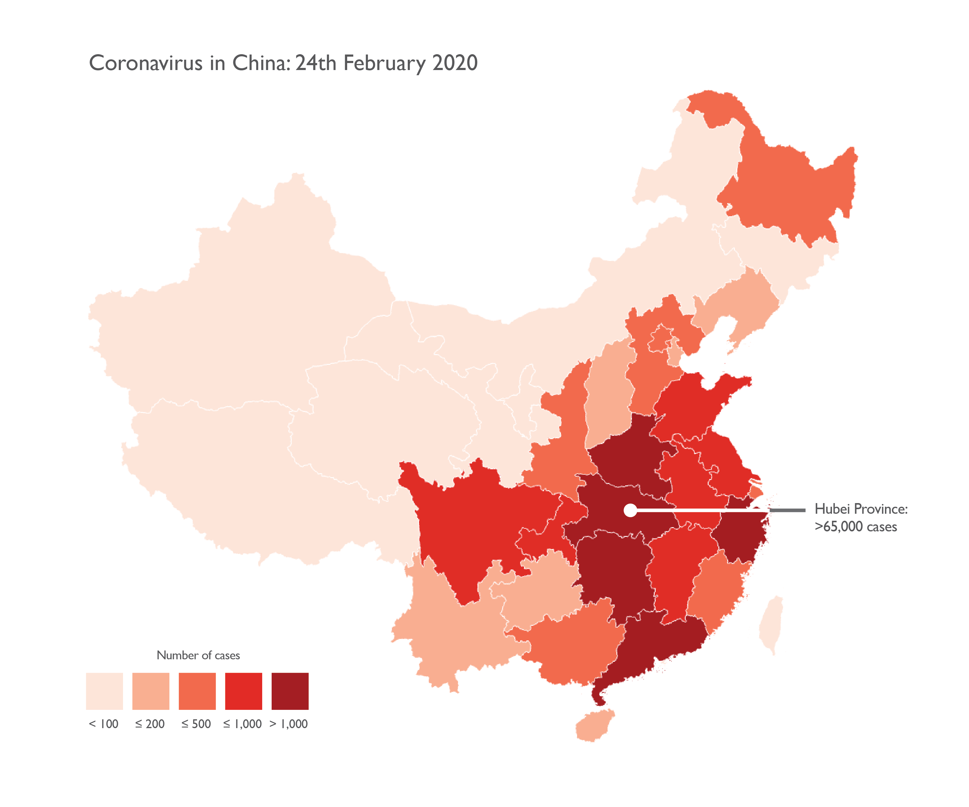
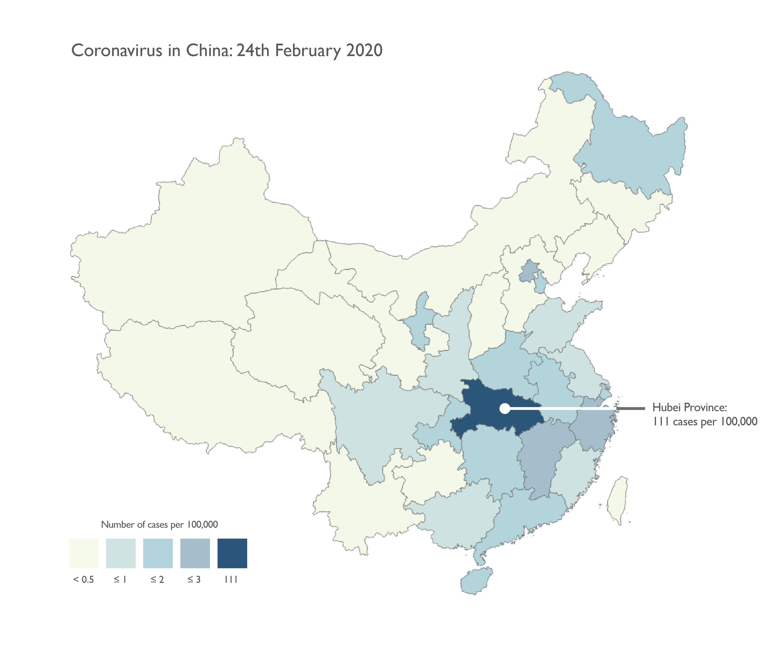
Map Source: Kenneth Field, https://www.esri.com/arcgis-blog/products/product/mapping/mapping-coronavirus-responsibly/
3. Does the map use appropriate symbols?
A choropleth map can also make large areas appear more important, because they take up more visual real estate on the map. For example: San Bernardino County in California is the largest county by area in the US, but has low population density. Because of its large area, this can make it appear visually more prominent in a choropleth map than counties with smaller areas, but higher populations. A proportional symbol or dot density map solves this problem when mapping things like cases of Covid-19.
In the Google map below, Greenland, Russia, and Canada appear very large and prominent, even though they have relatively low cases (partly due to their area, but also due to the use of the Web Mercator projection which distorts areas towards the poles to appear larger than they actually are). Hot spots like Italy and Iran that have smaller areas, don't appear as prominent.

map source: Screenshot of Google Covid-19 map taken 4/9/2020 https://www.google.com/covid19-map/
The New York Times uses a more appropriate map projection, as well as proportional symbols to map the same data.

Map Source: Screenshot of New York Times map taken 4/9/2020 https://www.nytimes.com/interactive/2020/world/coronavirus-maps.html
4. What level of geography is being mapped? Be especially wary of zip code maps.
Covid-19 maps at the country level might not give enough information about where the disease is concentrated (the scene looks much different in rural areas than cities). Maps of small geographies, like zip codes have their own issues. For an excellent description on why mapping by zip codes is problematic, see this post by cartographer, Lyzi Diamond.
See the tab on articles discussing Covid-19 maps for more considerations.
Maps in the news
The Georgia Covid maps that broke map twitter: https://twitter.com/andishehnouraee/status/1284237474831761408

Text: "In just 15 days the total number of #COVID19 cases in Georgia is up 49%, but you wouldn't know it from looking at the state's data visualization map of cases. The first map is July 2. The second is today. Do you see a 50% case increase? Can you spot how they're hiding it?"
Read the full thread for more information, but the tl;dr version is as follows:
- When comparing the scales of cases per 100,000 people, the numbers of each data bin have been adjusted to reflect the new upward limit of the data. If the range for each bin of the choropleth remained consistent over time, more counties would appear red on the second map. However, by adjusting the range, the data appears to have not significantly changed, especially if a map reader doesn't notice that the upward bounds of the data have changed from 4,661 to 5,165.
- While many on Twitter were quick to accuse the cartographer of nefarious intent to hide worsening cases of COVID-19, that might not necessarily be the case. On the original data site, maps are not shown side by side. Instead, a single map is shown with accompanying chart.

Screenshot taken July 20, 2020
- You can see that once again, the data bins have changed. If viewed side by side as they are in the original tweet, these maps do appear to be attempting to hide information about the worsening situation around COVID-19 in Georgia. However, taken in the context of the rest of the data site, it seems that might not be the case. Even if accusations of nefarious intent may not be warranted here, this is a great example of why it's important to read maps and data visualization critically! A casual reader checking the site daily would probably not notice that cases are steadily increasing if they only looked at the maps and did not pay close attention to the data.
-
Mapping Coronavirus, reponsiblyArcGIS blogpost by cartographer, Kenneth Field.
-
5 Questions to ask when you see a Coronavirus mapExcellent article by Garrett Dash Nelson - Curator of Maps & Director of Geographic Scholarship, Leventhal Map & Education Center at the Boston Public Library.
-
When Maps LieCity Lab article discussing spatial literacy in general.
-
Map Reveals Hidden U.S. Hotspots of Cornavirus InfectionScientific American article, illustrating the importance of adjusting values by population
-
Vox: How The Coronavirus Charts Can Mislead UsThis is a quick video from Vox explaining four ways that Coronavirus charts can be misleading. We highly recommend this video!