Interpreting Data
Most scientific papers and articles, especially in the STEM disciplines, will contain some sort of data. Data are related items of information that are considered collectively, usually obtained through scientific measures. Data can be displayed as numeric values, in tables, charts, graphs, or other figures. Interpreting data and it's associated expressions is extremely important to understanding the content of a scholarly article. Depending upon your area of study, there are a multitude of graphs that could be used by professional in the field. However, like reading a scientific paper, learning to interpret data is a process that takes practice. When interpreting data, keep these questions in mind:
- Is there a trend in the data?
- Is there a key, legend, or other descriptions available? If yes, what do they say about the data?
- Why is the data presented in the format it is? Could the data be presented in a more effective manner?
- What conclusions can be made from the data?
Different Types of Data Figures
While this is not a complete list of graphs, charts, or other forms of data modeling, these are common within STEM disciplines and will appear in varying formats.
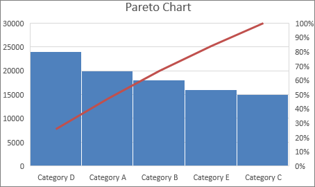
- Pareto Chart
- Pareto charts are a combination of a bar graph and a line graph. They depict the frequency of causes in a process.
- Circuit Diagram
- A circuit diagram depicts the electrical connections within a piece of electrical equipment or technology.

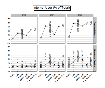
- Trellis Plot
- Trellis plots, also called trellis graphs or trellis charts are a way of depicting multivariate data. Each combination is graphed onto a separate panel.
- Function Plot
- A function plot depicts the varying output of data dependent upon its input.

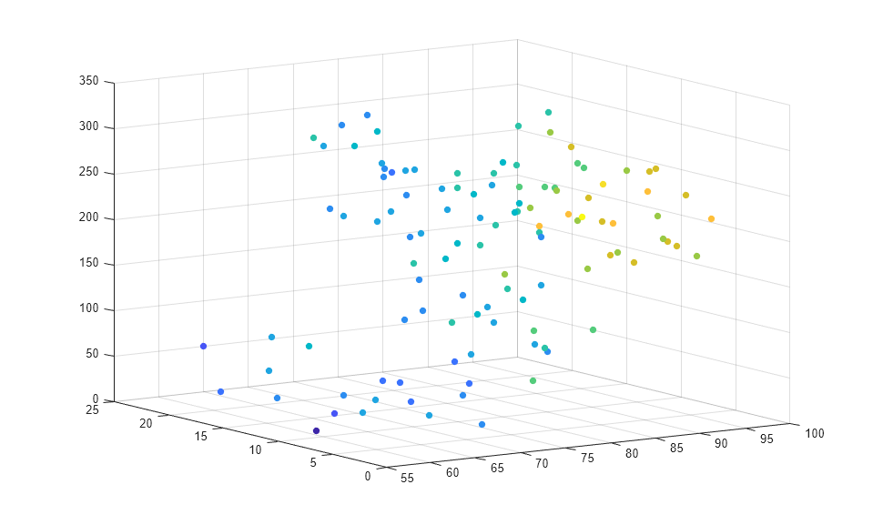
- Scatter Plot
- A scatter plot shows the effect of one variable on another.